Unraveling the Magic of Crochet Patterns: The Artistry of Color Choice
Welcome back to my crochet corner! I have been creating a lot of Custom Patterns these days, and one thing came up. So I decided to elaborate on it more.
Today, we’ll dive into a fascinating aspect of crochet pattern creation: The Role Of Colors.
Have you ever wondered why a Grayscale pattern requires fewer colors while a Colorful one demands a more extensive palette?
Join me as we explore the reasoning behind this phenomenon and discover the secrets behind the color selection process in crochet pattern design.
1. The Power of Grayscale:
When it comes to creating crochet patterns, grayscale serves as a powerful tool for simplification. By converting colorful images into shades of gray, we eliminate the complexity of color matching and focus solely on the interplay of light and dark. Here’s why grayscale patterns often require only five colors or less:
a) Contrast and Definition:
In grayscale, the contrast between light and dark shades enables us to highlight the intricate details of a pattern. This contrast allows for a clear definition between different elements, ensuring that the design remains discernible and visually appealing.
When we convert a color image into grayscale for crochet pattern design, we rely solely on variations in lightness and darkness to represent different elements of the design. This grayscale representation allows us to leverage the power of contrast to enhance the clarity and definition of the pattern.
Contrast refers to the difference in brightness between different areas of an image. In a grayscale pattern, this contrast between light and dark shades becomes particularly significant. By using varying shades of gray, we can create a distinct separation between different elements, lines, and shapes within the pattern.
By leveraging contrast and definition in grayscale crochet patterns, we can create visually striking designs that capture the essence of the original image. The play of light and dark shades adds depth, detail, and visual interest, allowing crocheters to recreate the intricate beauty of the subject matter with their stitches.
In summary, contrast and definition in grayscale crochet patterns go hand in hand. The contrast between light and dark shades brings out intricate details, while the clear definition ensures that each element within the pattern remains distinguishable. By utilizing these elements effectively, we can create captivating and visually appealing crochet designs that accurately represent the original image.
b) Simplification and Clarity:
By removing the distraction of colors, the pattern’s structure takes center stage. Each hue adds an additional layer of information and detail when working with colorful images. While this can be visually stunning, it can also make it more challenging to focus on the underlying structure of the pattern.
By converting a color image into a grayscale, we eliminate the distraction of colors and strip the image down to its fundamental elements: light and dark shades. This reduction lets us emphasize the pattern’s structure and highlights the interplay of lights and shadows. The contrast between the shades of gray provides a clear delineation between different elements of the design, making it easier for crocheters to interpret and follow the pattern.
With the focus primarily on light and dark values, the grayscale pattern reveals the underlying shapes, lines, and textures that form the foundation of the image. This simplification allows for a more precise translation of the image into crochet, ensuring that the resulting project maintains the essence and recognizable features of the original image.
Moreover, the absence of colors in a grayscale pattern makes it more approachable and more manageable for beginners and experienced crafters. It allows them to focus on stitch techniques, tension, and the project’s overall construction.
By prioritizing the pattern’s structure and simplifying the visual information, grayscale patterns provide clarity, guiding crocheters through each step and ensuring that the final project faithfully represents the original image. They offer a balanced blend of simplicity and intricacy, making them an excellent choice for those seeking a visually appealing crochet project that remains true to the original image while allowing for personalization through yarn color choices.
c) Universal Applicability:
Grayscale patterns are more appealing, as they can be easily customized to suit individual preferences. Crocheters can use their favorite yarn colors while following the grayscale pattern, resulting in a unique and personal creation that still maintains the integrity of the original design.
You can check out the Greyscale Crochet Portrait Patterns of Tina Turner in my Blog Post here.
And the Greyscale Crochet Portrait Patterns of Prince in my Blog Post here
And more books on Black and White Photography here.
2. The Multicolored Magic:
On the other end of the spectrum, we have crochet patterns bursting with many vibrant colors. Here’s why these patterns often necessitate a more extensive color palette, typically consisting of ten or more shades:
a) Capturing Realism and Depth:
Colorful patterns allow us to replicate the vibrant essence of the original image. By incorporating an array of hues, we can better capture the nuanced details, shading, and depth found in colorful photographs.
b) Color Gradations and Blending:
To accurately portray the variation in tones within an image, a wider range of colors is required. From subtle gradients to intricate blending techniques, the selection of multiple hues ensures that our crochet projects come alive, mirroring the visual complexity of the original source.
c) Artistic Expression and Creativity:
Colorful patterns provide an avenue for crocheters to unleash their artistic flair and experiment with different combinations of colors. Each stitch becomes an opportunity for self-expression, enabling crafters to infuse their personality into their creations and produce truly one-of-a-kind pieces.
You can check out The Colored Pattern of the Famous Starry Night Painting by Vincent Van Gogh here.
And The Colored Pattern of the Famous Mona Lisa by Leonardo da Vinci here.
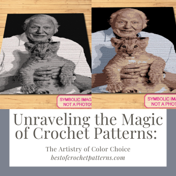
Let’s compare grayscale and colored crochet pattern using an example of a human portrait, highlighting the advantages and disadvantages of each approach. The perfect example is David Attenborough Blanket Pattern. I have used six colors to create the Greyscale Pattern, and eight colors to create the Colored Pattern. You can find all the patterns in my Etsy Shop here, or on my Website here.
Grayscale Crochet Pattern:
Advantages:
1. Simplified Interpretation: Grayscale patterns eliminate the complexity of color matching, allowing crocheters to focus solely on the interplay of light and dark shades. This simplification makes it easier to interpret and replicate the underlying structure of the portrait.
2. Enhanced Contrast and Definition: Grayscale patterns emphasize the contrast between light and dark areas, enhancing the definition of facial features. This clear distinction helps capture the subtle details of the subject’s face and ensures that the pattern remains visually appealing.
3. Universally Customizable: Grayscale patterns offer flexibility, allowing crocheters to choose their preferred yarn colors while following the grayscale template. This customization enables personalization and encourages creative expression.
Disadvantages:
1. Limited Color Reproduction: Grayscale patterns cannot capture the full range of colors present in the original image. While they excel in representing light and shadow, they may not fully replicate the vibrant and nuanced hues found in the subject’s complexion or clothing.
Colored Crochet Pattern:
Advantages:
1. Realism and Vibrancy: Colored patterns allow a more accurate representation of the original portrait’s colors, capturing the vibrancy and realism of the subject’s complexion, hair, and clothing. This realism can result in visually striking and lifelike crochet projects.
2. Greater Depth and Dimension: By incorporating a wide range of colors, colored patterns can achieve subtle gradations and blending effects, enhancing the depth and dimension of the portrait. This technique adds richness and complexity to the final crochet piece.
3. Artistic Expression: Colorful patterns offer crocheters an opportunity to showcase their creativity and artistic flair. With an extensive color palette, they can experiment with different combinations, adding their personal touch and creating unique interpretations of the original portrait.
Disadvantages:
1. Complexity and Color Matching: Colored patterns require careful color selection and matching to accurately represent the various hues in the portrait. Crocheters need to choose colors that closely resemble the shades in the original image, which can be challenging and time-consuming.
Additionally, managing multiple colors throughout the pattern may require more advanced colorwork techniques, such as color changes and carrying yarn with multiple yarns, making it more difficult for beginners.
2. Increased Materials and Costs: Creating a colored pattern typically requires a wider variety of yarn colors, resulting in increased materials and costs for crocheters. The need for multiple shades can be more resource-intensive and may require additional planning and budgeting.
3. Time-Consuming and Intermediate Skill Level: The intricate colorwork in a colored crochet pattern can significantly increase the time required to complete the project. The detailed color changes and stitch adjustments add complexity to the crocheting process, requiring more patience and attention to detail.
Consequently, colored patterns may be more suitable for intermediate-level crocheters who are comfortable with managing multiple colors and have a good understanding of colorwork techniques.
By acknowledging the added difficulty and skill level required for colored patterns, beginners can be aware of the potential challenges they may encounter and gradually work their way up to more complex projects. Intermediate and advanced crocheters, on the other hand, can embrace the opportunity to refine their skills and explore the artistic possibilities offered by colored crochet patterns.
In summary, while colored patterns offer realistic and vibrant representations with greater depth and artistic expression, their complexity, color matching requirements, increased materials, and intermediate skill level make them more challenging for beginners. Therefore, crocheters should consider their skill level, time commitment, and comfort with colorwork before embarking on a colored crochet pattern project.
Conclusion:
In the world of crochet pattern design, color choice holds incredible power. Grayscale patterns offer simplicity, clarity, and universal appeal, while multicolored patterns capture the beauty and realism of colorful images.
As crochet artists, we have the privilege of transforming photographs into intricate designs and translating visual wonders into tangible works of art.
Whether we opt for grayscale or embrace the kaleidoscope of colors, the choice ultimately lies in our creative vision and the desires of our customers.
So, grab your hooks, choose your palette, and let your imagination soar as you embark on your next crochet masterpiece!
Thank you for reading my Blog. You can find all the patterns in my Etsy Shop here, or on my Website here. And if you want me to create a Custom Pattern for you, you can find it here.
Have a beautiful day, and enjoy crocheting. And please share in the comments below if you like Colored or Grayscale Patterns more. Thank you.
Katja


